We created this prototype to try and make it easier for investors to compare sustainable funds and sustainability metrics.
How did we do this, and what did we find?
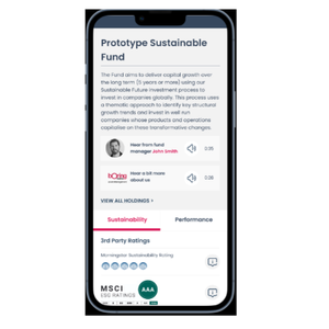
In interviews, investors told us they find an overarching objective useful as it gives an indication of the fund’s direction, priorities and holds the manager accountable.
Investors also indicated that reading a fund manager’s bio or ‘putting a face’ to a fund helps make the process more personable.
Based on feedback of desire for more interactivity, the audio clips were included, and investors liked the more personable approach.
They felt it gave insight to the manager and brand in a short, digestible snippet.
Quantitatively, alignment to the UN sustainable development goals was found to be the LEAST useful metric.
However, syndicate members use these metrics frequently and want to understand how to make these more useful to consumers.
With this in mind, we developed the prototype with the SDGs as a key focus to understand what needs to change to make them useful.
Qualitatively, the majority of investors had heard of SDGs, though they did not have a detailed knowledge.
However, if aligned to funds they want detailed explanation to better understand how a fund manager justifies this.
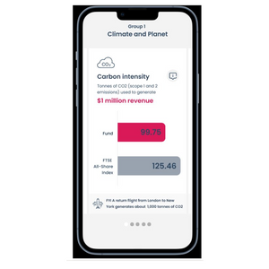
Investors want to understand sustainable metrics quickly and easily, and want simple explanations.
When tested, metrics with benchmarks (e.g. water usage and carbon intensity) were easily understood, and investors felt they could quickly grasp if a fund was doing well in these areas, and expressed the importance of the information button.
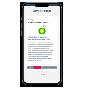
We know a barrier to investing sustainably is underlying holdings and lack of explanation as to why they’re included.
The example holdings section was a later addition. The investors who were shown the section liked the transparency and justification of certain holdings within the fund.
One example being BP - this helped investors imagine a situation in which a fund manager explains/justifies an arguably controversial holding.
Overall, investors felt the prototype would be an improvement on current sustainable communications.
Interviewees like the overview, and feel it is a good level of information which the ability to drill down into further detail if required.
Suggested improvements to consider:
Incorporating the ability to compare fund to fund, or to a benchmark of their choice.
More interactivity within the SDG section – ability to click onto an SDG for more detail.
Being able to filter the metrics to narrow down a list of funds – e.g., only seeing funds in a list if they have more than X% of women on boards.
Develop to be viewed on a desktop for those who prefer researching on a computer or laptop.
More diversity metrics, e.g. BAME people on boards.